
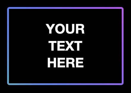
Gradient Animation CSS Box
This is a neat piece of code to add subtle motion to your sites…a gradient animation css box.
Style:
.box{
/* box styles */
position: relative;
color:#fff;
text-align:center;
font-family:Gotham, "Helvetica Neue", Helvetica, Arial, "sans-serif";
font-size:45px;
font-weight:bold;
text-transform:uppercase;
width:300px;
margin:50px auto;
background-color:#000;
padding:40px;
}

.box::before{
content: '';
position: absolute;
top: 0;
left: 0;
width: calc(100% + 12px);
height: calc(100% + 12px);
transform: translate(-6px, -6px);
background: linear-gradient(60deg,
#5ff281, #5f86f2, #a65ff2,
#f25fd0, #625f61, #f2cb5f) 0 50%;;
background-size: 300% 300%;
animation: gradient-animation 2.5s alternate infinite;
border-radius: 8px;
z-index: -1;
}
@keyframes gradient-animation{
50%{background-position: 100% 50%;}
}
body {background-color: #000;}
Body Div:
<div class="box">
Your<br />
Text<br />
Here
</div>
The gradient nnimation CSS box is a powerful tool that adds a dynamic and eye-catching element to your web design arsenal. By combining the elegance of gradients with the captivating motion of animations, you have the potential to create visually stunning and engaging user interfaces.
Through the steps outlined in this guide, you’ve learned how to implement gradient animations seamlessly, opening up a world of creative possibilities. Whether you’re crafting a portfolio, a landing page, or an interactive web application, this technique offers a unique way to draw attention to key elements and enhance user interaction.
Remember, the key lies not only in the technical execution, but also in thoughtful design choices. Consider color psychology, user experience, and brand aesthetics as you integrate gradient animations into your projects. Experiment with different gradient combinations, easing functions, and durations to find the perfect visual rhythm.
Furthermore, keep in mind that while gradient animations can be a powerful tool, moderation is key. Overuse or excessive complexity can potentially overwhelm users. Always prioritize a seamless and intuitive browsing experience.
As web design continues to evolve, staying updated with emerging trends and techniques like gradient animations is crucial. It sets you apart as a forward-thinking and adaptable designer, capable of creating experiences that resonate with today’s audiences.
Incorporating gradient animations into your skill set not only adds a layer of creativity to your work but also showcases your dedication to crafting exceptional user experiences. So, take what you’ve learned here and let your creativity flow. Elevate your designs, captivate your audience, and make your mark in the ever-evolving landscape of web design.